
I was honored last year when Michael Whitworth approached me about a special book he was putting together called Thoughts From The Mound, a collection of writings by Jeff Jenkins. I was thrilled and honored when he asked me to design the cover.
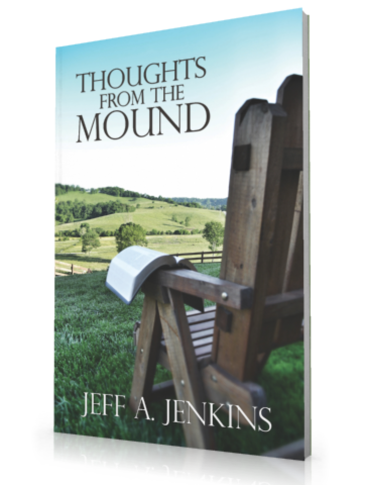
He wanted something simple, and actually used the phrase "maybe one of those comfy chairs overlooking some rolling hills." I was happy to oblige.
Photography normally isn't my strong suit, so in order to make the cover as great as possible, I need to make technology work for me.
I start out with sheer volume. I shot over 60 photos for the cover and picked only one. Professionals would actually shoot a lot more, perhaps hundreds of shots before settling on one that they could use. Overall, I took just over 100 total photos from about 3 different views.
Location and time of day were extremely important as well. Whereas some photographers would be able to shoot in a variety of different types of weather, I realize that I'm not that good - neither at Photoshop or at shooting in variable weather. I wait for a clear day before I go shoot.
The location happned to be in a church member's front yard, so it worked out for me to stay there and do what I needed to do that afternoon for as long as I needed. The chair was actually the church secretary's. The Bible on the edge of the chair was mine.
The photos were shot using a standard 18-55mm lens on a Canon D3100. The original resolution was 4608 x 3072 and I shot in RAW+JPEG format. There are lots of benefits to shooting in RAW that I won't go into, but basically you shoot with all the data available to you to edit later. Much larger photos in size, but you get all that data to work with. This is a great thing especially if you know you're going to take something into Photoshop.
I took a variety of shots stooping, sitting, and standing. I didn't fiddle with light settings too much at all, and I let the camera and its auto-focus do most of the work.
One of my fallacies in shooting photography is to want to compose the actual cover in my shot while I'm shooting. What I mean by that is I'm trying to frame the cover and make it look like the final product while I'm shooting. You're not supposed to do this, but I did anyways. Given the fact that I only had one lens, I pretty much had to.
I wanted to compose the cover with the chair facing what would be the spine of the book. I don't know if this a rule or not, but it seems to be a good one.
After shooting the photos I take them into Photoshop. This is where the transformation begins. I make sure to set my canvas to the appropriate size and resolution (in this case 5.5 inches wide by 8.5 inches tall, CMYK mode for printing, at 300 dpi). After cropping to appropriate size, I first I run Unsharp Mask to make sure everything on the picture is as sharp as it can be. I then make a Levels Adjustment Layer and bring the levels on the photo up or down based on the Levels Histogram. This evens out brightness and contrast pretty well usually, and I don't have to fiddle with that anymore.
Next is color adjustment. I really want the hills to pop and be the most significant thing you see besides the title. I make a seperate Color Adjustment Layer and slighly adjust the hills to look more green. Not too much, since they're already very green anyways.
The next thing I focus on is the blue sky. I use the Burn tool with a pretty high brush size (usually about 200 pixels or higher) in the Midtones range with an Exposure at 50%. I have "Protect Tones" checked while doing this. I lightly touch up the top of the sky just enough but not enough to interfere with the overall look. I've already decided the title is going to go in the top left.
I then work on the blur at the bottom right. I didn't need the blur to be obvious, I actually needed it to be subtle enough that you could ignore it. Jeff's author title will go here, so I need you to see the bottom of the chair but not be distracted by the detail of the chair. I use the Blur tool and a big brush to get the desired effect that I want. The Blur tool will layer on top of the effect you just made, so making the blur on top of another blur will just intensify that blur. I make sure the blur is most intense at the corner and work out.
Titling comes last. I used the font PerpetuaTitlingMT Light and varied the sizes in the title to make sure it was a well-designed layout. Simple and effective. I place a very subtle Drop Shadow under the text (about 4 pixels distance).
After saving into a variety of formats (PNG, JPEG, PDF) I send it to Michael. Cover is done.
So I hope you've enjoyed this step-by-step process for designing a book cover. I'd designed covers before, but never for a publication and never with my own photography. I think it turned out pretty great.