Posts in Tech
A Very Nice Budget Android Tablet
Screen Shot 2018-04-07 at 09.03.11.png

Let's be honest. The Android tablet market is, shall we say, lacking. The only major company putting out anything close to the iPad is Samsung, and even then it's not comparable to the app quality and productivity ecosystem on the iPad.

But what if you're an Android guy and don't have $650 to spend on an iPad? That's what the 10.5-inch iPad Pro costs, and sure, you can downgrade to the watered-down education version of the iPad for $329, but that's still up there. What if there was a sub-$100 tablet that could accomplish most of what you'd like to do?

That's where the Huawei (pronounced WAH-WAY) MediaPad T3-7 comes in. At just 7 inches, it's small by tablet standards, but it's a great little budget tablet if you're looking for something to browse the web, watch YouTube videos, or even display your lessons and preach from.

The MediaPad has a solid contruction of alumnium and a clear plastic front screen that's a magnet for fingerprints (but really, what device isn't these days?). The screen resolution isn't retina-quality, but it is an IPS display at HD resolution. It also doesn't get the brightest, so using this tablet outside in the sun is probably not reccommended.

A huge plus is the micro SD card slot that get you up to 128GB of extra space. So you can load up movies and TV shows on your card and fire up VLC and watch away. Very helpful for long flights or hotel stays without good wifi.

Because of these shortcomings and the lack of an Apple logo, the Huawei MediaPad is only going to set you back about $79. The best place to get it? Walmart. You can also get the companion case that I have here.

This is a great little budget tablet, and normally I would have no reservations reccomending it, but there is one caveat: the US Government has reccomemended not to use Huawei phones, citing that the Chinese government might conduct espionage on the devices. As long as that doesn't bother you (I still intend to use mine for light use and playing emulators), then go ahead. Just be advised.

All in all, if you'd like to get a cheap tablet that can run a good full version of Android without a lot of cruft, this may be a solution for you. It's not the most powerful, but the Huawei MediaPad T3-7 is a great little device with good build quality.

Using Things 3
Video courtesy of Cultured Code

Video courtesy of Cultured Code

For a while now, you may have noticed that I’ve been radio silent on Omnifocus. I love Omnifocus and all that the Omnigroup do for apps and productivity, but about 6 months ago I decided to try something simpler. I thought a power user like myself needed something like Omnifocus - that the myriad of great features and settings was a nerd’s playground for me. But I got to where I was more frustrated by Omnifocus rather than happy with it, which, turns out, was more of a reflection upon myself rather than the app. I was getting bogged down in the structure and features rather than actually getting anything done. 

Things by Cultured Code has a long iOS history - they were one of the first Task Manager apps I remember on the iPhone. They were an app on the App Store before iOS was called iOS, circa 2008, in the first round of application on the release of the App Store. And while years passed and I had forgotten about it, Things version 3 had me taking another look. I had given popular apps like Todoist a try and get didn’t feel them. Things 3 clicked almost immediately for me and my needs. 

Every To Do List app has a philosophy, and Things 3 uses a concept called Areas to manage your different lists. You can, of course, choose not to break your tasks down into Areas, but I find it extremely helpful to do so, since I’m involved with so many different organizations and projects. But if you’re not always everywhere like me (most times I wish I wasn’t), you can break down your Areas into different areas of responsibility, such as Preaching, Teaching, Housekeeping, etc. 

Areas help you organize your different Project lists, and you can be as specific or as broad as you like. For example, in my Graymere Area, I have a number of different Project lists - one for this week and next week, one for different initiatives I’m working on, and so on. If I need to move one of these, it’s a simple as dragging and dropping on macOS, or simply tapping and hitting Move on iOS. 

Some of my favorites are in the details. For example, every task has a couple of options: Set a Due Date, set a Deadline, Tag a task, or make a Sub-List. I love the Sub-List feature because if I have a relatively low-priority set of tasks like say, a shopping list, I can make those checklists under one task and not clog up the works. 

Another dead simple feature is the Notes section - not just under Project headings but also each individual task as well. This is helpful for say a speaking engagement where I want to put the topic and scripture, but also for simple things like links to check out. 

There’s also a number of categorization features that help you in organization as well. The Inbox is simply any task you thrown into Things 3 without being assigned to a specific project. You can use this how you wish, but I use it as a holding area to move those tasks to the appropriate Projects. Today is, well, self-explanatory. This is anything in any list that you specify needs to be done today. Upcoming is a helpful list view with a calendar that shows you tasks that you have put Due Dates on and when they are due. 

The best part is that Things 3 looks seamless and fluid with the same user interface across all three platforms: iOS, iPad, and macOS. Unfortunately for Windows and Android users, Cultured Code has no plans to come to those platforms. 

If you're looking for a clean, simple task manager with a few features but not a hundreds options, Things 3 may be for you. It doesn't break the mold and offer tons of new stuff, but it gets the job done cleanly and easily. Check out all the features at the Cultured Code website

What's a Finstagram?

This is part two of my three-part series on Understanding Instagram. Read part one here.

Screen Shot 2017-09-18 at 15.29.56.png

What in the round world is a Finstagram?

Well, if you think about it, Instagram is nothing but perfectly curated photo posts making life appear pretty perfect. At least, with teens. Because with teenagers who won’t speak up in Bible class because they’re afraid they’ll be made fun of for what they say would never post anything on Instagram that wasn’t perfect. 

There’s a side to everyone that we see represented on social media - the perfect selfies, the glamorous events, the beautiful friends. But there’s also a side that we don’t take pictures of - the time we spilled a whole gallon of milk on the kitchen floor or just waking up with bed head in the morning. The latter is more real life, and teens have taken to creating Finstagrams (or fake Instagrams) as a way of sharing photos from their lives that they may not want anyone to see. 

Don’t jump to conclusions here - most teens aren’t creating these to share inappropriate or naked photos of themselves - Instagram is pretty good at not allowing that. But the thing to remember here is that even if everything they are sharing is harmless, they still have an account that you as a parent do not know about. 

Ask your kids if they have a Finstagram and you’re likely to get some raised eyebrows. 

Think about this. As a teen, you never wanted to hang out with your parents - in fact, it was the last thing you wanted to do. You just wanted to be wherever they were not, even if that meant hanging out in the grocery store parking lot. 

Teens have moved that mentality to the digital space. They have made false identities and fake accounts because they want to express their creativity and their independence. The fear with something like Finstagram is that they can so easily be lured to something that is detrimental to their Christian walk - and that they are keeping something from you. 

Finstagrams should be a teaching tool for us as parents to tell our kids that it’s completely okay to be just who you are on social media just as in real life. There is a growing disconnect in young people where they separate their digital lives with their real ones - and we need to be teaching the opposite. That your digital life and real life go hand in hand. We’re all living on these devices now, and if we’re trying to hide something, that’s wrong.

If you think your child may have a Finstagram, simply open the Instagram account on their phone, tap on the Profile icon at the bottom right corner, and see if they have any additional accounts listed under their main account. Kids are likely following their own Finstagrams and so are their close friends, so looking at who they follow is important as well. 

Apple Keynote Rewind

Apple's new iPhone X. 

Apple today conducted a jam-packed keynote for the first time in their new Steve Jobs Theater, a separate space on their new Apple Park Campus, slated to officially open later this year. 

Apple announced new Apple Watches, new Apple TVs, and three new iPhones. Let's dive in. 

Apple Watch: Series 3 with the biggest feature of cellular LTE built right in. That means you can answer phone calls and texts (even stream Apple Music) while being completely separated from your phone. The Apple Watch S3 still gives you all-day battery life, twice as fast performance, and is still at the nice price of $329 without LTE and $399 with it. Apple touted the Watch as the #1 watch in the world. Available September 22. 

Apple TV: 4K finally comes to Apple TV, but that's not all - Apple TV now supports HDR. If you don't know what HDR is, go into a Best Buy and check it out. You won't believe the difference. The new Apple TV comes with a A10X Fusion chip to deliver twice as fast processing. In addition to 4K HDR movies on the iTunes store for the price of regular HD movies, all your HD movies now get upgraded to 4K+HDR for free. Live sports and news channels are coming later this year, with Apple Music and Homekit access built in right away. Available September 22. 

iPhone 8/8+: The base iPhones got a big upgrade in a number of areas, and are going to be a fantastic new edition to the iPhone line. The 8 now features a glass front and back, a True Tone display (like the iPad Pros), new stereo speakers, a new A11 Bionic chip which is 70% faster than the iPhone 7, and an updated 12-megapixel camera with a slew of new features. New portrait modes and lighting effects, new 4K and Slo-Mo video upgrades, and new hardware inside the cameras designed specifically for Augmented Reality. Oh, and the glass back not only looks nice, but it let's you wirelessly charge the phone as well. Both models start at 64GB storage standard, and the 8 will be $699 and the 8+ $799. Available on September 22. 

iPhone X: The brand-new flagship phone for Apple is now the iPhone X (pronounced iPhone Ten). The screen is the biggest difference - it's edge-to-edge and fills up the entire front of the phone, minus a cutout at the top for the True Depth Camera System. The TDCS allows you to unlock you phone with your face. That's it. No fingerprint sensor on this phone - not even a home button. You swipe up from the bottom of the screen to return home. The screen is a 5.8" Super Retina OLED, the first OLED in an iPhone. This one is the premium, expensive model, starting at $999 for the 64GB model. Available November 3. 

My Quick Thoughts: Apple Watch and Apple TV updates are wonderful, especially the HD content I've invested in on Apple TV now getting an auto-upgrade to 4K. If I'm a "regular" consumer and not a nerd, I go for the iPhone 8. It's a great upgrade for what you get. If you're nursing a old iPhone right now and need a new one, iPhone 8/8+ is the way to go. You get a great screen, new colors, and a phenomenal camera. For those that say "I'm getting the X," I'll say that demand for this phone, despite the price tag, will be incredibly high. You will be extremely lucky to get one by Christmas this year. Most of us will be waiting until March to get one. 

Overall, a strong keynote from Apple in my opinion. Good to see that they're pushing the envelope a bit again. 

Search & Explore on Instagram
Instagram_logo.svg.png

This is part one of my three-part series about Understanding Instagram. 

Instagram is my happy place. It's where my perfectly curated collection of things I like to look at is all consolidated into one feed. I go there not only to just keep up with friends, but also look at things that interest me. 

A ministry friend called me up recently and told me that he was speaking with someone in his congregation about an addiction to pornography. Oddly enough, he said that he was told by this individual that the thing that kept tripping him up was the Search & Explore section on Instagram. 

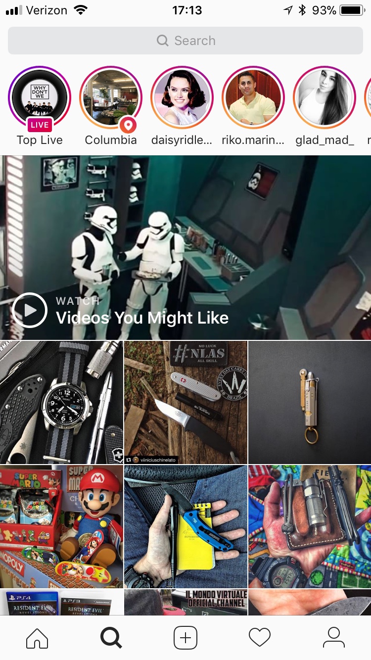
I'll be honest - very rarely do I use this feature on the Instagram app. I pretty much follow who and what I want to follow and I look through my Stories and Feed daily. But if you tap on that tab at the bottom of the app (labeled as a simple magnifying glass), you might be surprised what you find. 

A screenshot of the Search & Explore tab on my account. Basically just Star Wars, Nintendo, and knives. 

A screenshot of the Search & Explore tab on my account. Basically just Star Wars, Nintendo, and knives. 

According to Instagram, the Search & Explore section does this: 

Posts are selected automatically based on things like the people you follow or the posts you like. You may also see video channels, which can include posts from a mixture of hand-picked and automatically sourced accounts based on topics we think you’ll enjoy.

Instagram, just like an social network, doesn't have people picking stuff out for you, it allows an algorithm to do that. And that algorithm is basing what it shows you in that Search & Explore section based upon who you're following and the posts that you have liked. That second part is much more telling: Instagram will inject their own hand-picked accounts into your Search & Explore tab based upon what they think you might enjoy. 

So, let's say a 21-year old young man follows just a few Instagram accounts that contain violence, vulgar music, or scantily-clad women. And based upon his likes on those accounts that he follows, the Search & Explore feed is going to show him more and more of that kind of stuff. 

So is there any way to disable the S&E feed? No. Is there any way to keep it locked down so you can still use Instagram? No, not unless you use Instagram through the browser, which doesn't let you use the S&E feature but also doesn't allow you to post anything. 

So what's the solution here? Just as I've said before on countless occasions, there is no substitute for you having your child's username and password and logging into their account every week. If you allow your children to have an Instagram account, you need to be making sure that you know everything that happens on said account. 

The most obvious way to avoid seeing content you don't want is to unfollow the accounts in question. You probably don't want to go unlike every photo, but eventually the algorithm will figure out that this content isn't of interest to you any longer. Creating a new account and archiving the old one is also an option, but make sure your child doesn't create extra Finstagrams, or fake Instagram accounts (which I'll talk about in an upcoming post) nor should your child have access to the old account. 

Obviously, digital parenting is a real thing. We as parents are getting dizzy on the ever-shifting landscape of apps and social media trying to keep up with our teens. But don't give up and don't give in. Protect your child, bring them up in the Lord. 

You can follow exactly what I'm reading right here on the site with my Reading List, and make sure you follow me on Twitter and Instagram as well.